Turning a Messy To-Do List into a Project You Can Actually Finish

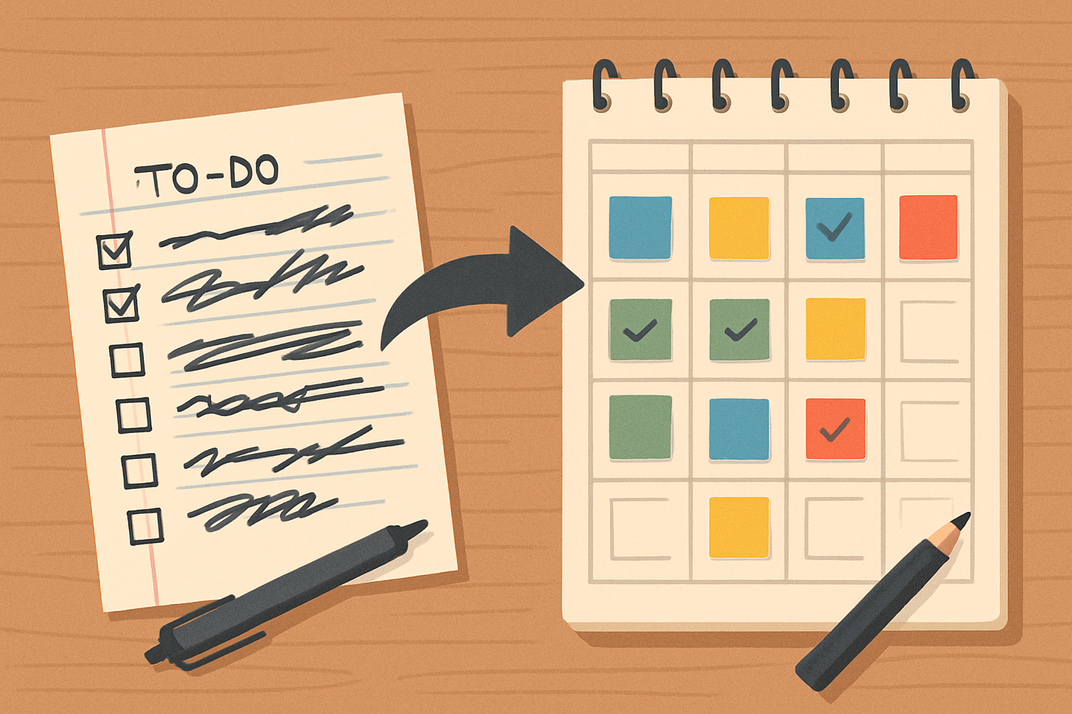
Agile is a simple idea: build in short steps, listen to users, and be ready to change course fast. It’s used far beyond apps now, from classrooms to hospitals, because life rarely goes exactly as planned. Castañón-Puga and colleagues explain that many teams visualize work on a task board with three columns—To-Do, In Progress, Done—so everyone can see where things stand at a glance. Their study demonstrates how this setup aligns well with “earned value management” (EVM), a method for comparing what was planned with what was actually accomplished and spent. In plain terms, EVM answers: are we on time, on budget, and getting the value we expected?

Here’s the cheat sheet. Planned Value (PV) is what you expected to finish by now. Earned Value (EV) is what you truly finished. Actual Cost (AC) is the actual cost. Two quick ratios tell the story: SPI = EV ÷ PV (schedule health) and CPI = EV ÷ AC (cost health). If SPI or CPI is below 1, you’re slipping; above 1, you’re ahead. Think of a group project: if you planned to write four pages this week (PV), wrote only two (EV), and spent more hours than expected (AC), your SPI and CPI will warn you early, before the deadline panic hits.

The authors developed a simple simulator that resembles a Kanban board. Tasks move from To-Do to Done while team “agents” pick them up, work on them, and sometimes finish early or experience delays. A small dashboard displays a burndown chart of remaining tasks, a PV-EV-AC chart, and a live CPI/SPI plot, allowing you to see the project’s pulse in real-time. You don’t need fancy math to use the idea: keep a board, log the time you expected versus the time you actually spent, and watch the two indices. It’s like tracking study goals: set your plan, record actual hours, and spot slips before exam week.

What makes this practical is how small chances of “good luck” or “bad luck” add up. In 2,100 simulated runs, the team tested different conditions—namely, the number of people, the number of tasks each person juggles, and the odds of finishing early or late. A clear pattern emerges: higher chances of being delayed push CPI down, while higher chances of finishing early push CPI up. The number of people or tasks per person matters less than those delay/advance probabilities. So in everyday terms, reducing blockers and distractions (delay) and creating tiny speed-ups (advance) beats simply “throwing more people” at the work. Try time-boxing, clearer handoffs, or removing one recurring bottleneck; your CPI/SPI will thank you.

Why care? Because plans meet reality every day. Projects mix predictable steps and surprise twists, so you need flexibility and a quick feedback loop. A simple board, combined with an EVM, gives you both: you see the work, you measure progress, and you adjust quickly. Start small this week—list tasks, estimate hours, log actuals, and compute SPI and CPI. If they dip below 1, don’t stress; focus on fixing the causes you can control: fewer multitasking switches, fewer interruptions, and faster reviews. That’s how you turn a messy to-do list into a finish line you can actually reach.

Reference:
Castañón-Puga, M., Rosales-Cisneros, R. F., Acosta-Prado, J. C., Tirado-Ramos, A., Khatchikian, C., & Aburto-Camacllanqui, E. (2023). Earned Value Management Agent-Based Simulation Model. Systems, 11(2), 86. https://doi.org/10.3390/systems11020086

Privacy Notice & Disclaimer:
This blog provides simplified educational science content, created with the assistance of both humans and AI. It may omit technical details, is provided “as is,” and does not collect personal data beyond basic anonymous analytics. For full details, please see our Privacy Notice and Disclaimer. Read About This Blog & Attribution Note for AI-Generated Content to know more about this blog project.

City Building 101: Why “Where Stuff Goes” Shapes Your Day

Sandoval-Félix et al. examine a simple question with significant everyday effects: where should a city allocate homes, jobs, and roads to ensure smooth operation? They model Ensenada, Mexico, and introduce a handy idea called “Attractive Land Footprints.” Think of these as spots that are extra tempting for new factories because they’re near workers and big roads, on gentle slopes, and away from homes. These spots don’t stay put—they pop up, move, shrink, or disappear as the city changes. That constant shape-shifting is why planning rules need to keep up.

Here’s the twist: the model finds that more of these “attractive” factory zones fall in places the current rules don’t allow than in places they do. In plain terms, demand for good industrial space exceeds what the plan permits. That mismatch pushes industry to bend rules or sprawl into awkward spots, which you feel as longer commutes, clogged streets, and noisy trucks cutting through neighborhoods. The authors even see a future “attractive” corridor forming along a northeastern road—useful if the road exists and rules adapt, frustrating if not.

Density—how many people live in an area—ends up being a quiet hero. When density is low, the city spreads out, and those attractive spots are quickly consumed by other uses, especially housing. The model shows that at 10–15 people per hectare, as much as 65% of those desirable areas can be urbanized in a single year; at around 35 people per hectare (Ensenada’s current average), that drops to about 14%. Translation: Compact neighborhoods help protect space for jobs, which in turn protects your time and wallet. If density slips lower, industry tends to locate in worse places more often, and residential projects often occupy the very land that would have made commutes shorter and deliveries cheaper.

So what should young residents take from this? First, roads matter: without strong connections, even “perfect” locations won’t work, and good jobs end up farther away. Second, rules matter: if plans ignore how attractive spots really form, the city grows in messy ways you feel daily. Third, your housing choices matter too: choosing, supporting, and voting for denser, well-located neighborhoods helps keep industry near major roads and workers, not next to your bedroom window. In short, smarter density, updated rules, and better road links make everyday life—commuting, deliveries, prices—smoother for everyone. That’s the message behind the model: pay attention to where stuff goes, because it quietly shapes how you live.

Reference:
Sandoval-Félix, J., Castañón-Puga, M., & Gaxiola-Pacheco, C. G. (2021). Analyzing urban public policies of the city of Ensenada in Mexico using an attractive land footprint agent-based model. Sustainability (Switzerland), 13(2), 1–32. https://doi.org/10.3390/su13020714

Privacy Notice & Disclaimer:
This blog provides simplified educational science content, created with the assistance of both humans and AI. It may omit technical details, is provided “as is,” and does not collect personal data beyond basic anonymous analytics. For full details, please see our Privacy Notice and Disclaimer. Read About This Blog & Attribution Note for AI-Generated Content to know more about this blog project.

How Rumors Actually Travel in Your Group Chats

Think of your friends as dots and the relationships between you as lines. That picture—a network—can tell us a great deal about how a message travels. Raya-Díaz and colleagues explain that we can describe who’s connected to whom with something called an adjacency matrix, which is just a grid that marks a 1 when two people are linked and 0 when they aren’t. From that grid, you can spot who knows lots of people (their “degree”) and even find “hubs,” those super-connected folks who shrink distances in a network and speed things up. In simple terms, if a rumor hits a hub, it can quickly jump to many others.

But not all groups look the same. One shape the authors use is the “barbell” network: two tightly connected friend groups, separated by a thin path—perhaps that one person who belongs to both circles. In this setup, what happens to a rumor depends a lot on the people sitting on the bridge between the two sides. If the bridging person doesn’t pass things on, one whole half may never hear the news. That’s why “betweenness centrality”—basically, how often someone sits on the shortest route between others—matters so much for real communication. The higher your betweenness, the more you act like a hallway everyone has to walk through.

The team modeled a classroom to show this in action. Each student had a few simple traits: the number of connections they had (degree), how close they were to everyone else, whether they were on those in-between routes (betweenness), and—crucially—whether they chose to cooperate by passing the message along. One student initially received the rumor; after that, its spread depended on two factors: their willingness to share and the degree of betweenness of the neighbors they spoke to. When the “bridge” students cooperated, the message flowed to both sides; when they didn’t, it stalled, even if plenty of people on each side were chatty. You’ve seen this in everyday life: a club hears about an event only if the one friend who’s in both the club and your class actually tells them.

So what can you do with this? First, notice the bridges in your world—the friend who hops between group chats, the classmate in multiple circles, the teammate who also runs student council. If you want something to spread fast (a study guide, a show, a fundraiser), talk to them early. If you want to keep something confidential, be cautious about sharing it with people who belong to different groups. And remember, spreading isn’t automatic; it’s a choice. In the authors’ simulations, flipping cooperation on or off at the bridge changed everything—proof that a single person can shape what the whole network knows. That awareness helps you share more effectively, avoid misinformation, and ensure the right people actually hear what matters.

Reference:
Raya-Díaz, K., Gaxiola-Pacheco, C., Castañón-Puga, M., Palafox, L. E., & Rosales Cisneros, R. (2018). Influence of the Betweenness Centrality to Characterize the Behavior of Communication in a Group. In Computer Science and Engineering Theory and Applications, Studies in Systems, Decision and Control (Vol. 143, pp. 89–101). https://doi.org/10.1007/978-3-319-74060-7_5

Privacy Notice & Disclaimer:
This blog provides simplified educational science content, created with the assistance of both humans and AI. It may omit technical details, is provided “as is,” and does not collect personal data beyond basic anonymous analytics. For full details, please see our Privacy Notice and Disclaimer. Read About This Blog & Attribution Note for AI-Generated Content to know more about this blog project.

Smarter “Maybes”: How Fuzzy Logic Helps Us Model Real Life

Ever notice how most choices aren’t yes or no? You’re not just “tired” or “awake,” your shower isn’t only “hot” or “cold.” Real life lives in the in-between. Flores-Parra and colleagues present a simple way to model fuzziness, allowing non-experts to build smarter simulations in NetLogo, a free tool that many students already use. Their idea is to plug in fuzzy logic—rules that accept shades of meaning—so digital “agents” make choices more like people do.

Here’s the core idea in plain terms. A fuzzy inference system is a set of everyday IF-THEN rules that turn inputs into decisions. Think: IF the room is “a bit warm” AND my budget is “low,” THEN set the fan to “medium.” In their toolkit, you name your inputs and outputs, define what words like “low,” “medium,” and “high” mean (those are membership functions), write a few rules, and then test the results on real numbers to see the decision the system makes. There are two flavors: Type-1 (great when things are fairly clear) and Type-2 (better when there’s extra uncertainty, like noisy sensors or vague opinions). The toolkit guides you through inputs, outputs, membership functions, rules, and evaluation, so you don’t get overwhelmed by the math.

You can build these rules by hand or let data suggest them. The team shows both paths. In a classic NetLogo voting model, they add a fuzzy rule so that each patch “prefers” blue or green depending on nearby votes—much like a friend is swayed by the vibe of their group, rather than just a strict majority. Then they flip to data-driven mode: using census information from Tijuana, they cluster neighborhoods and auto-generate fuzzy rules that classify agents as Catholic or non-Catholic, then watch how people move if they don’t feel similar to neighbors. The cool part is that the toolkit exports a ready-to-use file you drop into NetLogo, so your agents can start making fuzzy decisions right away.

Why should you care? Because this is how many daily systems actually work. Apps can sort posts by “kind of relevant,” not only “relevant.” A fitness plan can adjust when your sleep is “so-so,” not purely “bad.” City planners can weigh “a little traffic” against “big safety gains.” Flores-Parra et al. point out uses in tech profiles, social and eco systems, health risk, planning, and even prices and markets. If you’re modeling anything—study habits, saving money, a club’s attendance—start with simple fuzzy rules you believe (“IF stress is high AND time is short THEN study in 25-minute sprints”), then, when you have data, let clustering refine those rules. Manual rules are easy to understand; data-mined rules can be truer to life. Mix both, test often, and remember: in real life, “a bit,” “mostly,” and “it depends” are features, not bugs.

Reference:
Flores-Parra, J. M., Castañón-Puga, M., Gaxiola-Pacheco, C., Palafox-Maestre, L. E., Rosales, R., & Tirado-Ramos, A. (2018). A Fuzzy Inference System and Data Mining Toolkit for Agent-Based Simulation in NetLogo. In Computer Science and Engineering Theory and Applications, Studies in Systems, Decision and Control (Vol. 143, pp. 127–149). https://doi.org/10.1007/978-3-319-74060-7_7

Privacy Notice & Disclaimer:
This blog provides simplified educational science content, created with the assistance of both humans and AI. It may omit technical details, is provided “as is,” and does not collect personal data beyond basic anonymous analytics. For full details, please see our Privacy Notice and Disclaimer. Read About This Blog & Attribution Note for AI-Generated Content to know more about this blog project.

Why Flight Cancellations Don’t Have to Wreck Your Day (and What Networks Have to Do with It)

Think of a busy airport like a giant group chat: lots of people, many links, and constant messages. Parra et al. explain that systems like this are “complex” because they’re made of many simple parts that interact all the time—no single boss controls everything, but patterns still appear, a bit like ant colonies working together without a leader. That’s why a few airports seem “popular” hubs with tons of connections, while others are quieter. In a single-layer view of the European air network, some airports have over 100 direct links, so if one of those big hubs fails, the whole trip can fall apart.

Here’s the twist: life isn’t just one layer, and neither are airline routes. You might fly the same city pair with different airlines. A “multilayer” view treats each airline as its own layer. That matters because a problem in one layer (say, Airline A cancels) doesn’t kill the route if Airline B still flies it. Parra et al. show that in this multilayer setup, each layer has fewer connections than the all-in-one map, but that’s actually good for resilience—you can still switch layers to keep moving. In their example, one airline layer had 42 airports and 53 flights (20 of which were also flown by other airlines), and another had 44 airports and 55 flights (25 of which overlapped). Translation: backup options exist.

Now imagine your flight gets canceled. What happens next isn’t just luck—it can be modeled as a simple two-round “offer–counteroffer” chat between a passenger agent and an airline agent. Round one: you propose a fix; the airline accepts or rejects. Round two: the airline counters; you accept or reject. If no one agrees, you end up with a refund (the “conflict deal”). In their tests, many simulated passengers chose “fly tomorrow” over fighting it out, because it avoids the conflict outcome. In one airline layer, the average was about 27, choosing “tomorrow,” and 16 ending in conflict; in another, “tomorrow” averaged 27.6, and conflict 17.4. That sounds familiar: when travel gets messy, the practical win is often a simple reschedule.

So what’s useful for your day-to-day? First, know that big hubs really do matter—more links mean more ways through the system, but also bigger headaches if they go down. Second, check alternatives by airline, not just route; another “layer” might save your trip. Third, when a cancellation occurs, a quick and reasonable counteroffer (such as accepting next-day travel) can often work out better than digging in, because the other side is using a similar playbook and the clock is ticking. Parra et al. even note this approach can be extended to delays and connections later on, which is basically everything you care about when traveling. Understanding the network—and how simple negotiations unfold—helps you stay calm, select smart options quickly, and keep your plans on track.

Reference:
Parra, J., Gaxiola, C., & Castañón-Puga, M. (2018). Multi-layered Network Modeled with MAS and Network Theory. In Computer Science and Engineering Theory and Applications, Studies in Systems, Decision and Control (1st ed.). Springer. https://doi.org/10.1007/978-3-319-74060-7_6

Privacy Notice & Disclaimer:
This blog provides simplified educational science content, created with the assistance of both humans and AI. It may omit technical details, is provided “as is,” and does not collect personal data beyond basic anonymous analytics. For full details, please see our Privacy Notice and Disclaimer. Read About This Blog & Attribution Note for AI-Generated Content to know more about this blog project.